It’s early June. Your tax appeal is already in motion. EDMs are out. Meta and Google ads are live. Now all eyes are on your donation page.
We know the feeling. The refreshes. The nerves. The pressure—because the outcome of this campaign might shape how the year ends. Or even your next board meeting.
At Happy Fundraising, we’re with you. We aim to care more about our clients’ campaigns than they do.
We work closely with only a small group of clients, not just offering technical expertise, but helping carry the emotional weight. Hiring us allows you to also outsource some of your sleepless nights to us!
And we know your landing page is where all the work comes together. Your ads and emails grab attention and get that click, but the landing page is where hearts and minds are won; the part where someone decides to give.
Let’s make sure yours is pulling its weight.
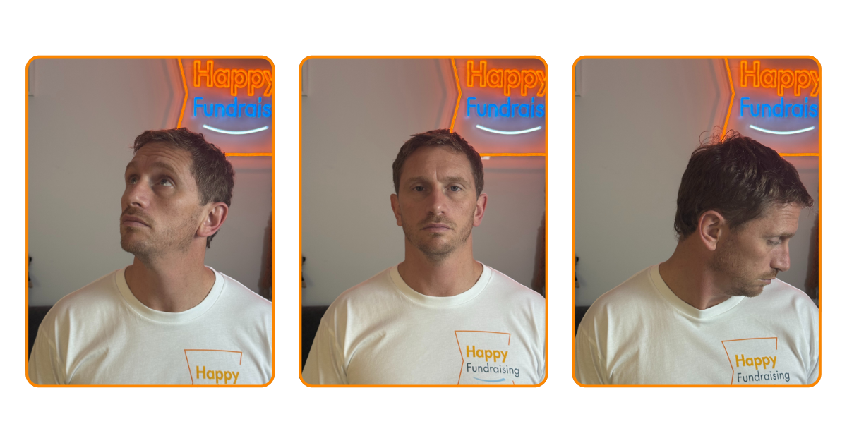
Images of case studies looking directly at the camera increase emotional connection.
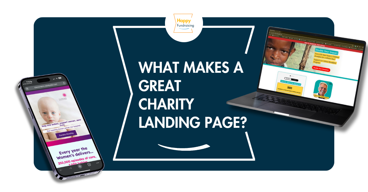
Must-Have Essentials
Emotion That Converts
Start with emotionally powerful imagery. Real photos showing the problem—not just the solution—go a long way. Ideally, use a subject looking directly into the camera. That eye contact triggers trust and emotion in a way no stock photo ever could.
Copy That Moves
Your copy needs to hit emotionally. Use language that makes people feel the problem and the solution. Words like:
- heartbreaking, saddening, urgent (for the problem)
- life-changing, incredible, inspiring (for the solution)
Add clear, direct calls to action like Donate now or Save a life today. These aren’t just slogans—they’re conversion tools.
Mobile First
Most donors will land on your page via their phone. Your donation page must be mobile optimised. It should load quickly, look great, and—this is key—feature a big, bold donation button above the fold (right at the top before scrolling). Repeat the button as needed, but make sure it’s visible straight away.
Keep It Simple
Clarity wins over cleverness. Stick with simple layouts, strong headings, and easy navigation. Use bolding to help guide the eye to your key points.
Make It Pop
Contrast matters. Your donation button should stand out. Even if it’s not one of your brand colours—make it pop. A bright red button on a blue-green page? Absolutely.
Build Trust Fast
Trust signals are non-negotiable. Add the ACNC logo, payment security icons, and privacy policy links. These subtle cues reassure your donor that their money is safe.
Use the Right Tools
Platforms like Raisely and Funraisin are made for fundraising. They include donation-optimised templates and integrate well with tracking and email tools. If you’re still using a standard website builder, this is an upgrade worth considering.
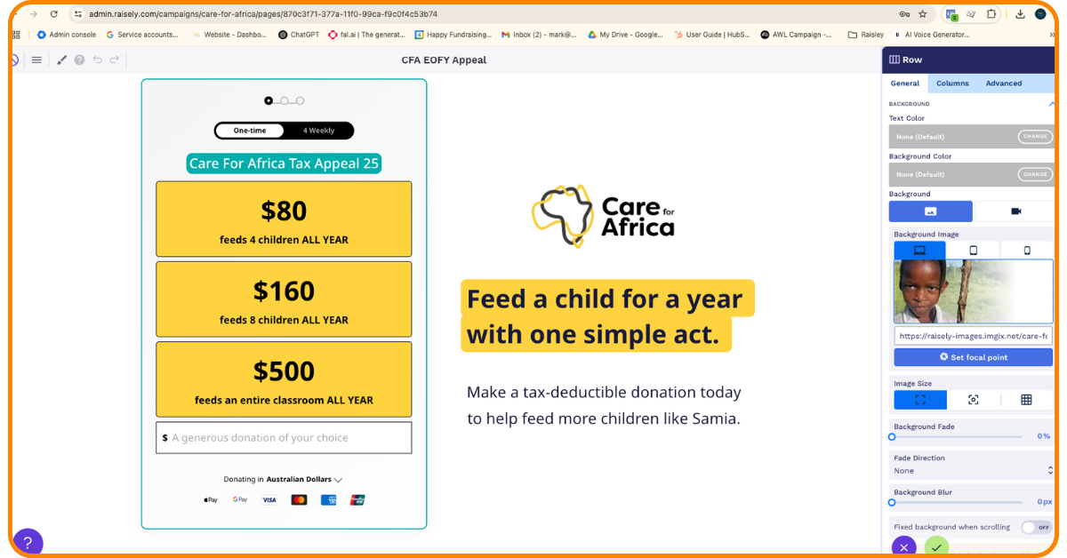
We love Raisley – built for fundraising, easy to use.
Nice-to-Haves (Once You’ve Got the Basics)
Real Over Polished
Polished photos are fine—but don’t be afraid to use something raw. Sometimes, a genuine iPhone shot from a frontline staff member or beneficiary can outperform a studio photo. Authenticity often beats aesthetics.
Proof People Care
Social proof builds confidence. Add a donor ticker, a short testimonial, or a quote from a supporter. These elements show that others have already acted—and can help move someone from interest to action.
Scroll-Friendly Buttons
Don’t rely on just one donation button. Add more throughout your page—especially at the bottom. Many visitors scroll first before making a decision.
Get the Data
Tracking isn’t optional. Set up Meta Pixel, Google Tag Manager, and UTM parameters to track where your donors are coming from. Not sure how? Your developer or platform support team can help. It’s worth it.
Next-Level Tools & Tactics
Match Copy to Audience
Tailor your copy length based on who you’re targeting. Older readers may prefer a story; younger ones want short and snappy. The golden rule? Test what works.
Test Video Carefully
Videos can work—but only if you have the time and budget to test. Don’t add video just for the sake of it. A poor or untested video can reduce conversions.
Invest in Pros
As your budget grows, consider investing in professionals. Great copywriters, designers, and developers can dramatically improve your results. Not because it looks flash—but because it performs better.

A good landing page won’t fix a weak appeal. But a weak landing page can absolutely tank a good one.
Get the essentials right. Then layer in the extras. Then test, refine, and repeat.
If you’re running a tax appeal and wondering if your page is pulling its weight, we’re happy to take a look—or just swap war stories over coffee.
Let’s make your campaign as good as it deserves to be.
Want a free landing page check-up or examples of what’s working right now? Message us today or DM me on LinkedIn.
Let’s build better fundraising, one landing page at a time.